Redesign of the Community Development section of the Federal Reserve Bank of Kansas City Website.
They wanted an updated look that still fit in with the current look and feel of the overall website design.
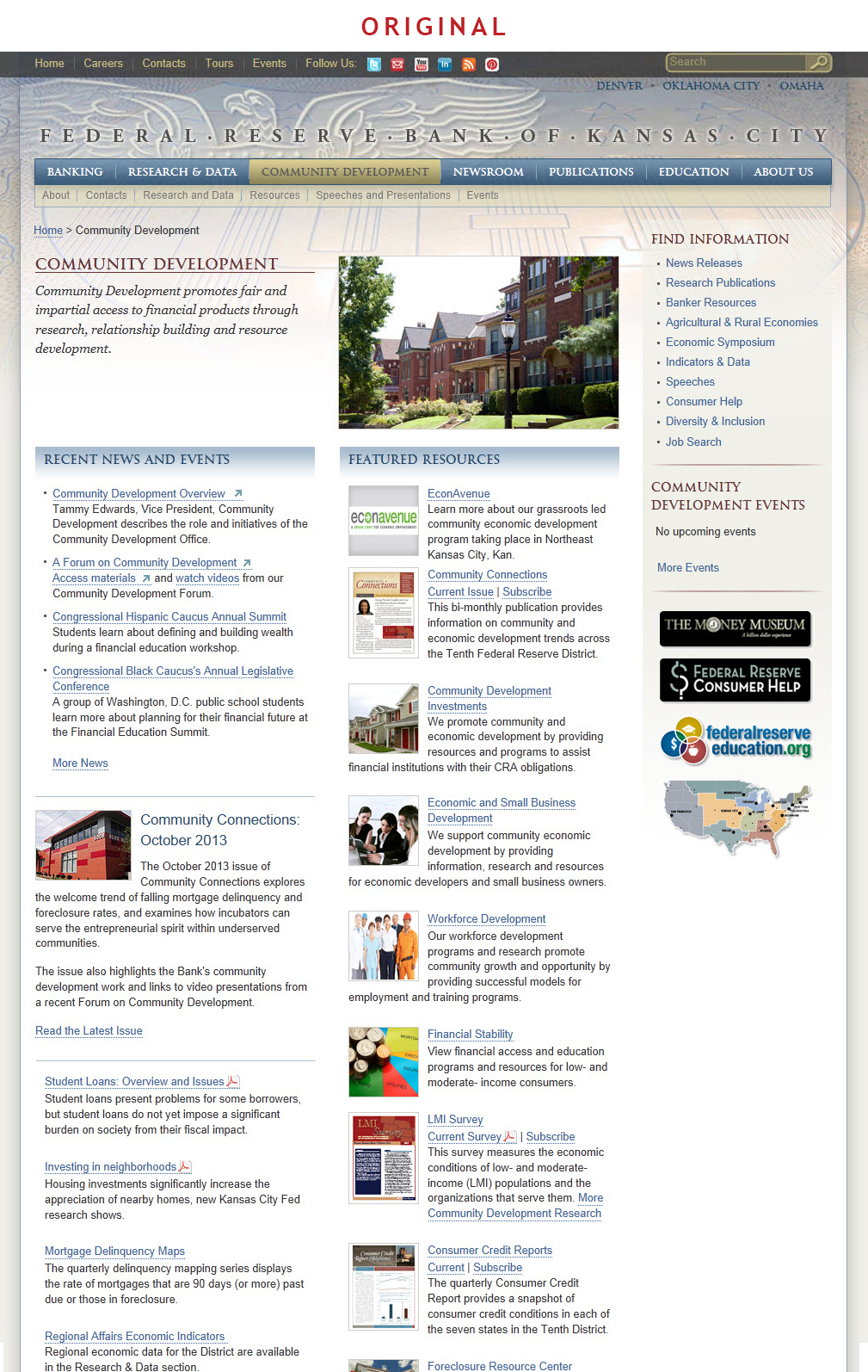
Image 1: The original landing page design.
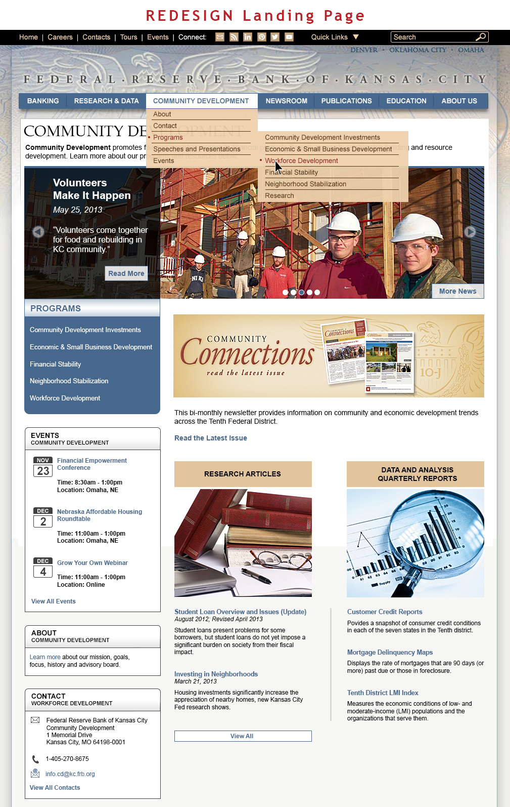
Image 2: The new landing page web redesign with a look at some of the rollover interactivity.
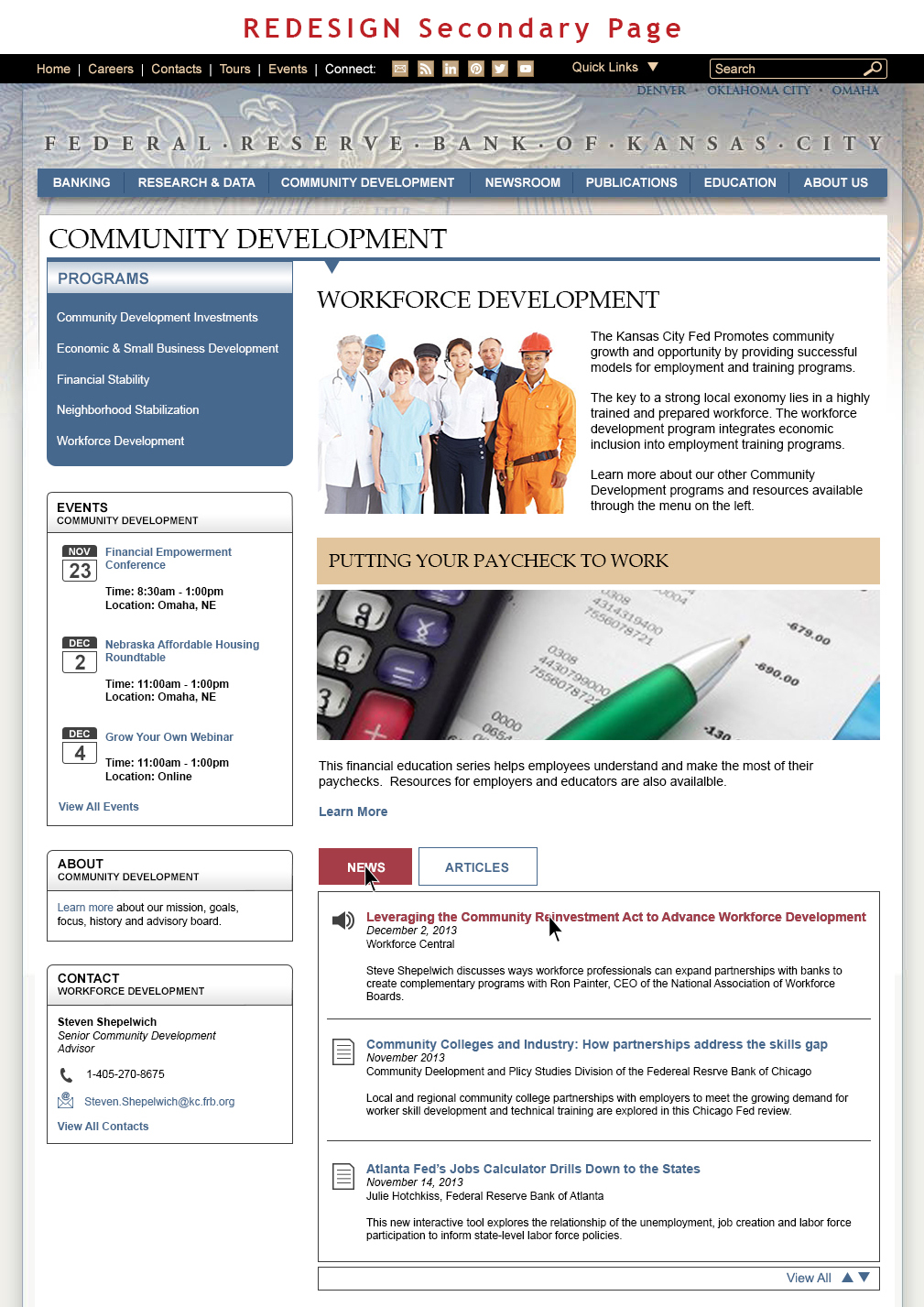
Image 3: The new secondary page web design with a look at some of the rollover interactivity.
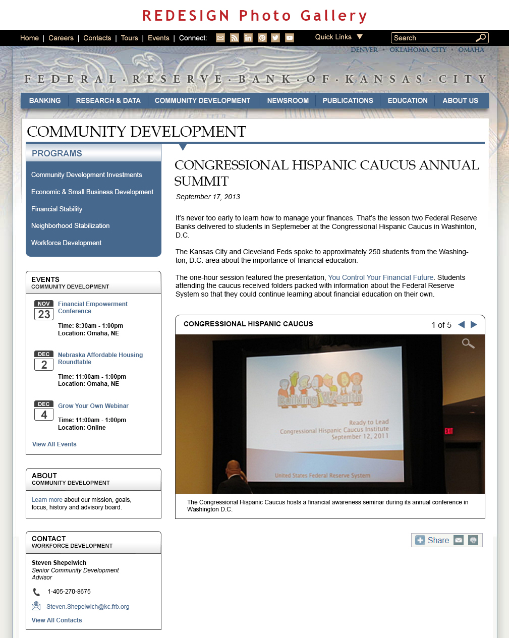
Image 4: The new photo gallery design.
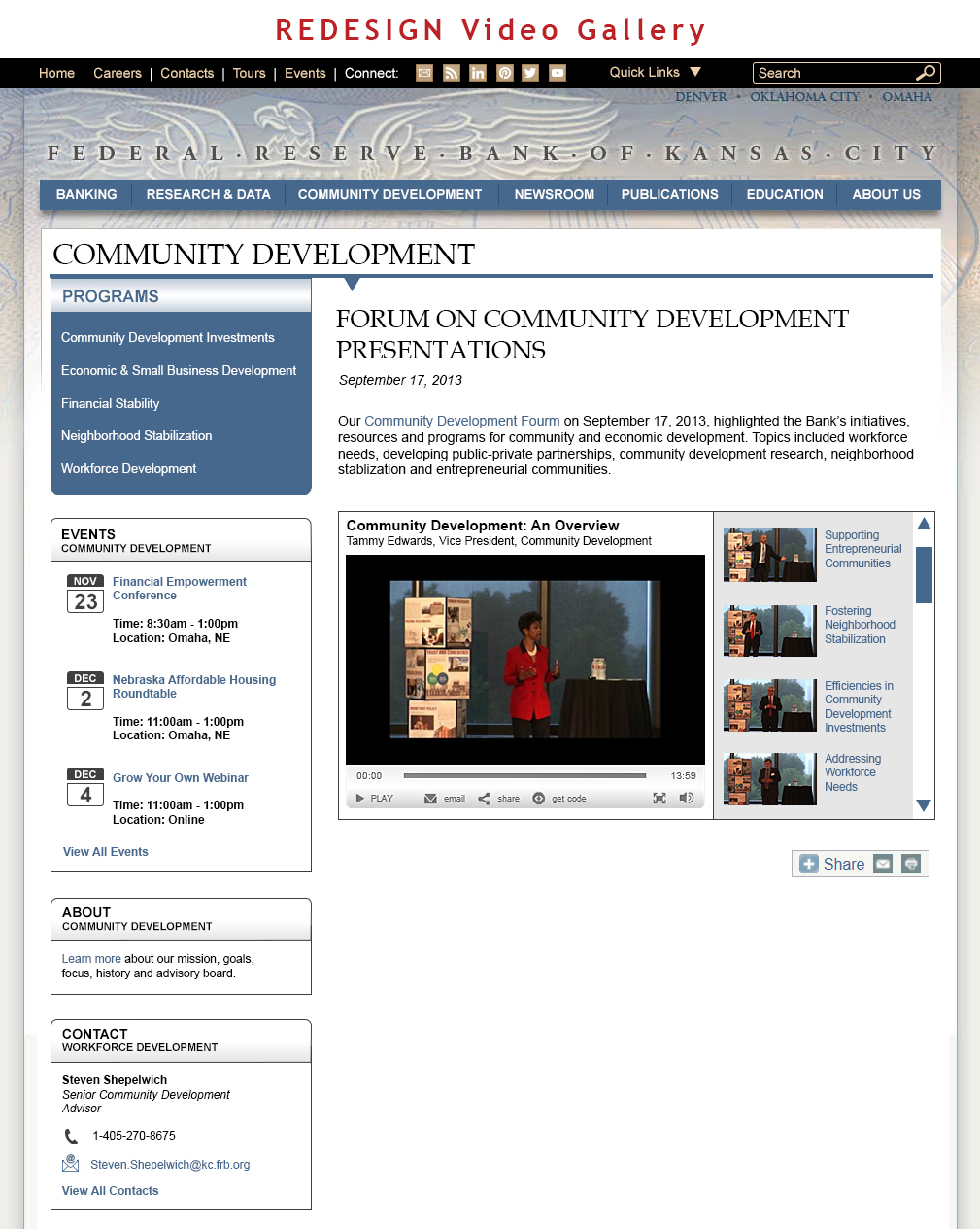
Image 5: The new video gallery design.

