HTML Email Redesigns for the Federal Reserve Bank of Kansas City.
They wanted something somewhat similar but with a more organized compact footer and a refreshed look and feel that still kept with their branding.
These were then created as templates in their Email System. Individual elements were also created as snippets/widgets to allow the end user the ability to build their own email with this branded look and feel.
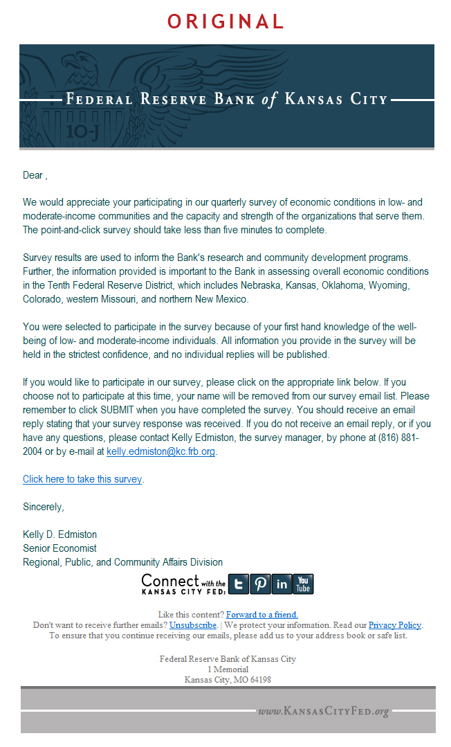
Image 1 General Emails: The original look and feel of their emails.
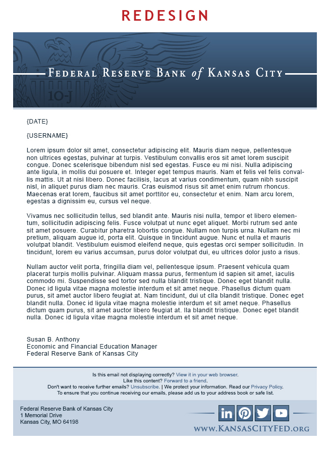
Image 2 General Emails: The redesign.
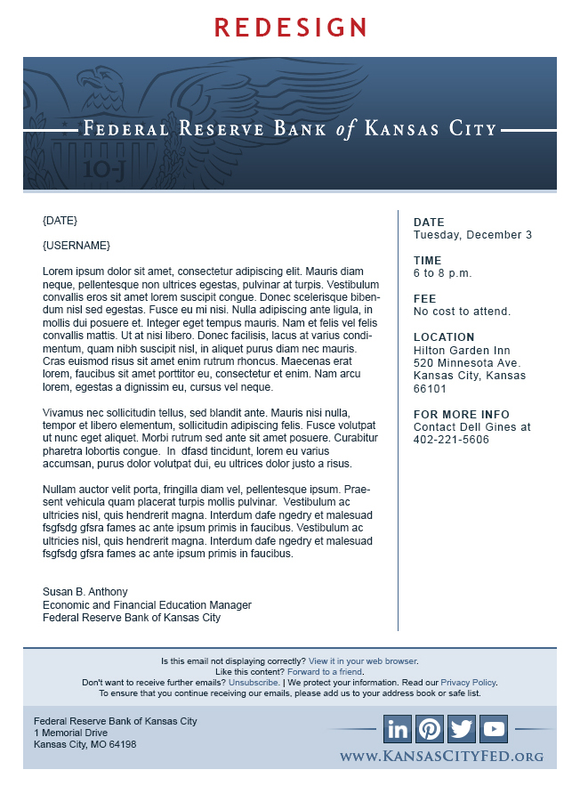
Image 3 General Emails: The two-column option where they could put photos and/or text in the smaller columns.
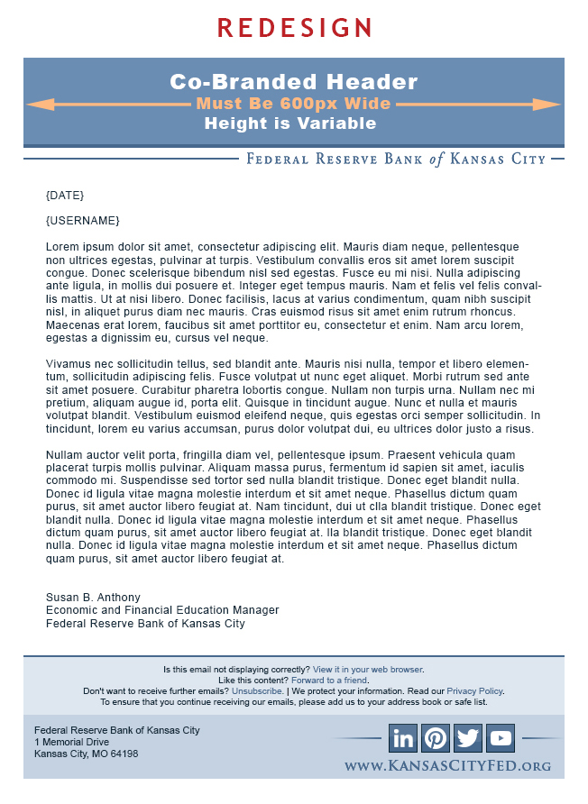
Image 4 General Emails: The co-branded option that would allow them to promote something else while still showing that it is from the Federal Reserve Bank of Kansas City.
Image 5 Community Connections Email: The original look and feel of this email.
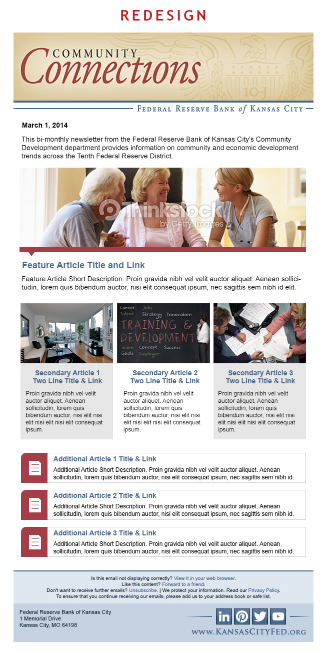
Image 6 Community Connections Email: The redesign.
Image 7 Econ Ed from the Fed Email: The original look and feel of this email.
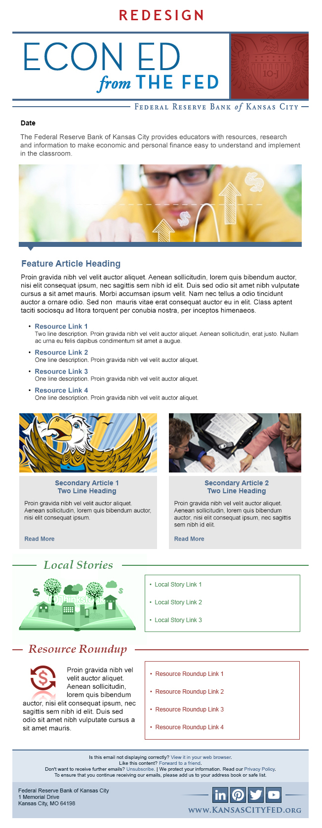
Image 8 Econ Ed from the Fed Email: The redesign.

