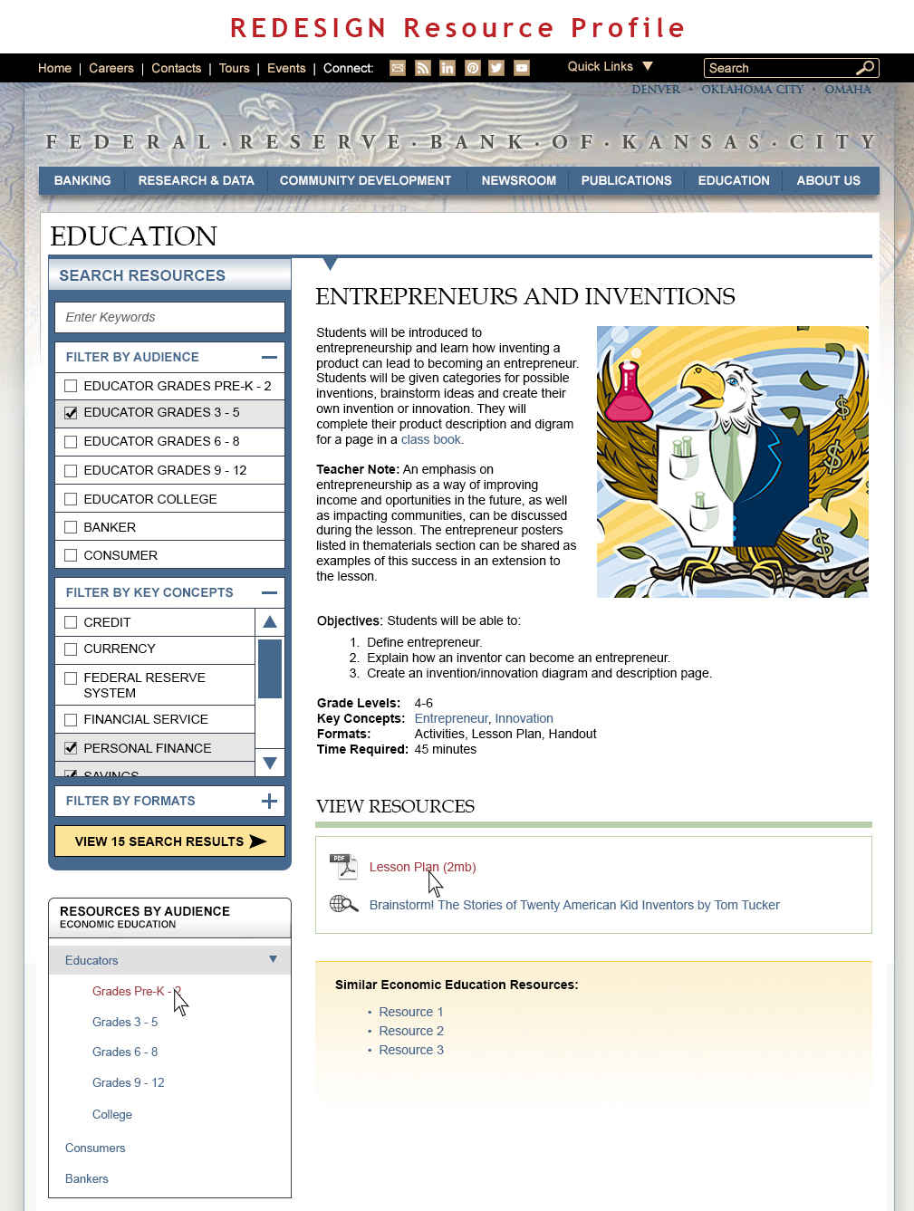
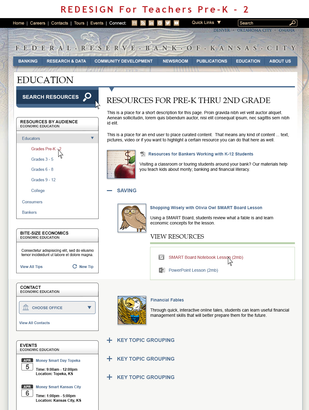
Redesign of the Education section of the Federal Reserve Bank of Kansas City website.
They wanted an updated look that still fit in with the current look and feel of the overall website design.
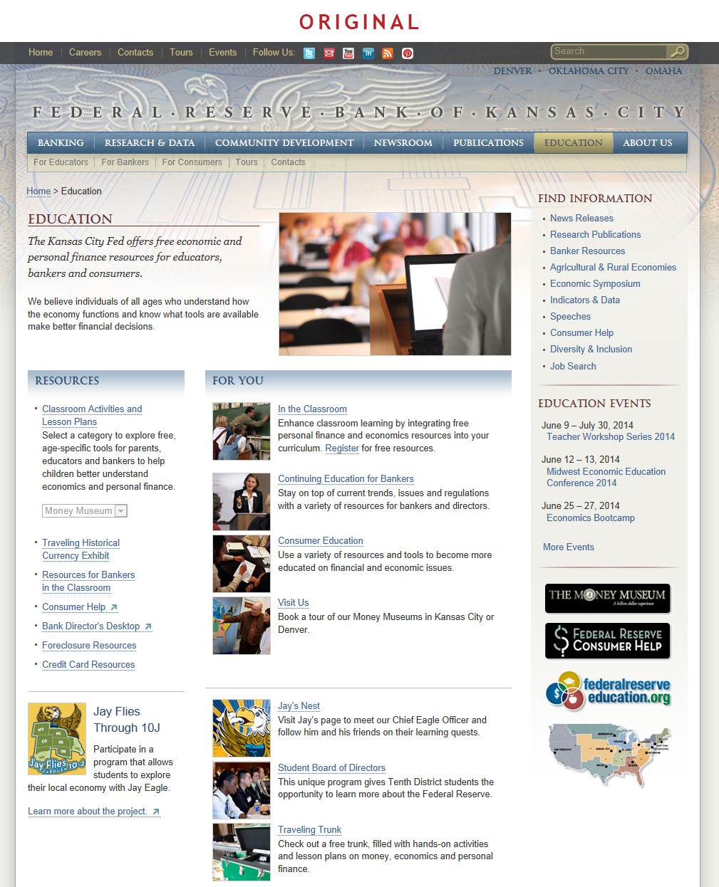
Image 1: The original landing page for this section.
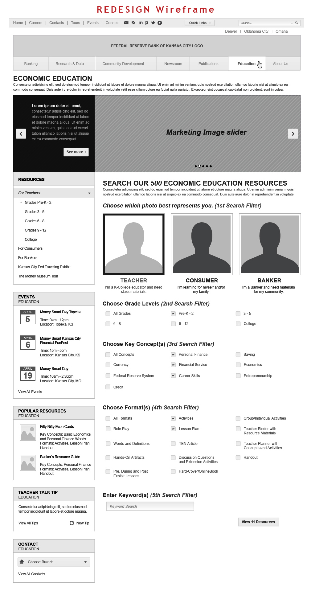
Image: A wireframe.
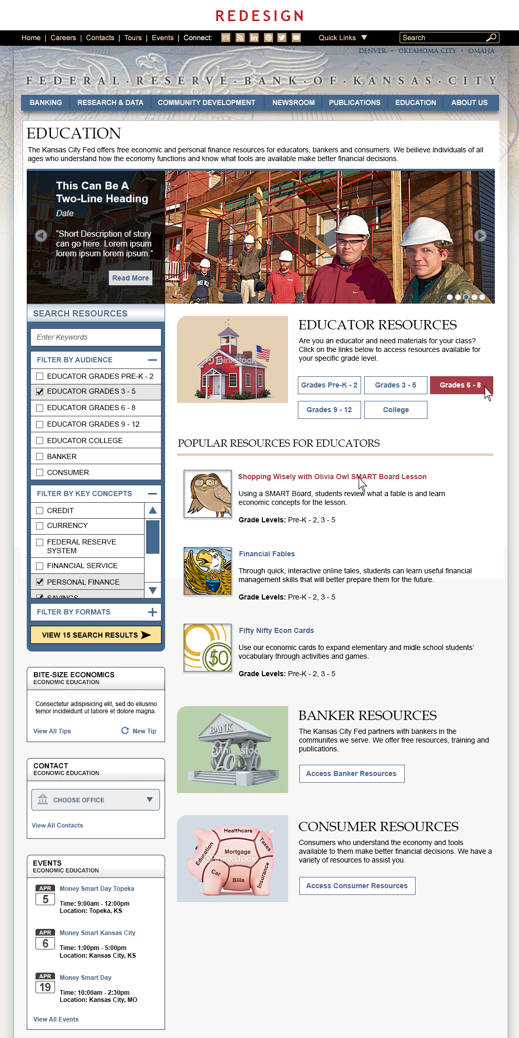
Image 3: The new landing page web redesign.
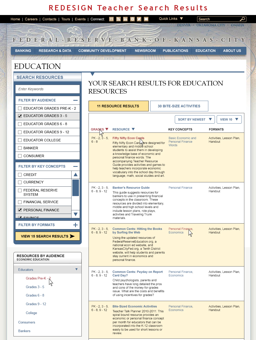
Image 4: With the new functionality of being able to search for a resource, this image shows what that results page looks like.
Image 5: The redesigned single resource profile page.
Image 6: The design for the new multiple resources information page.

